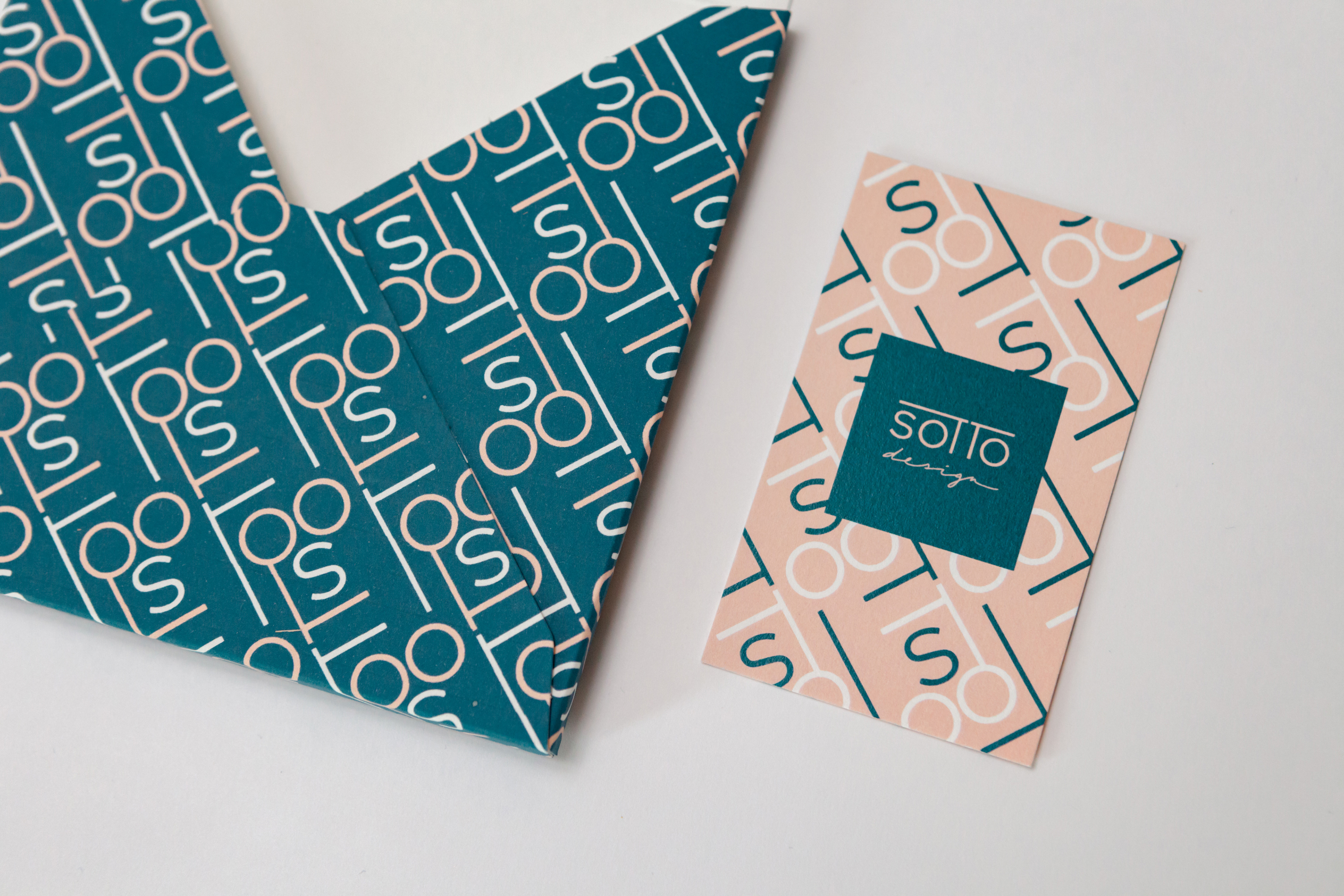


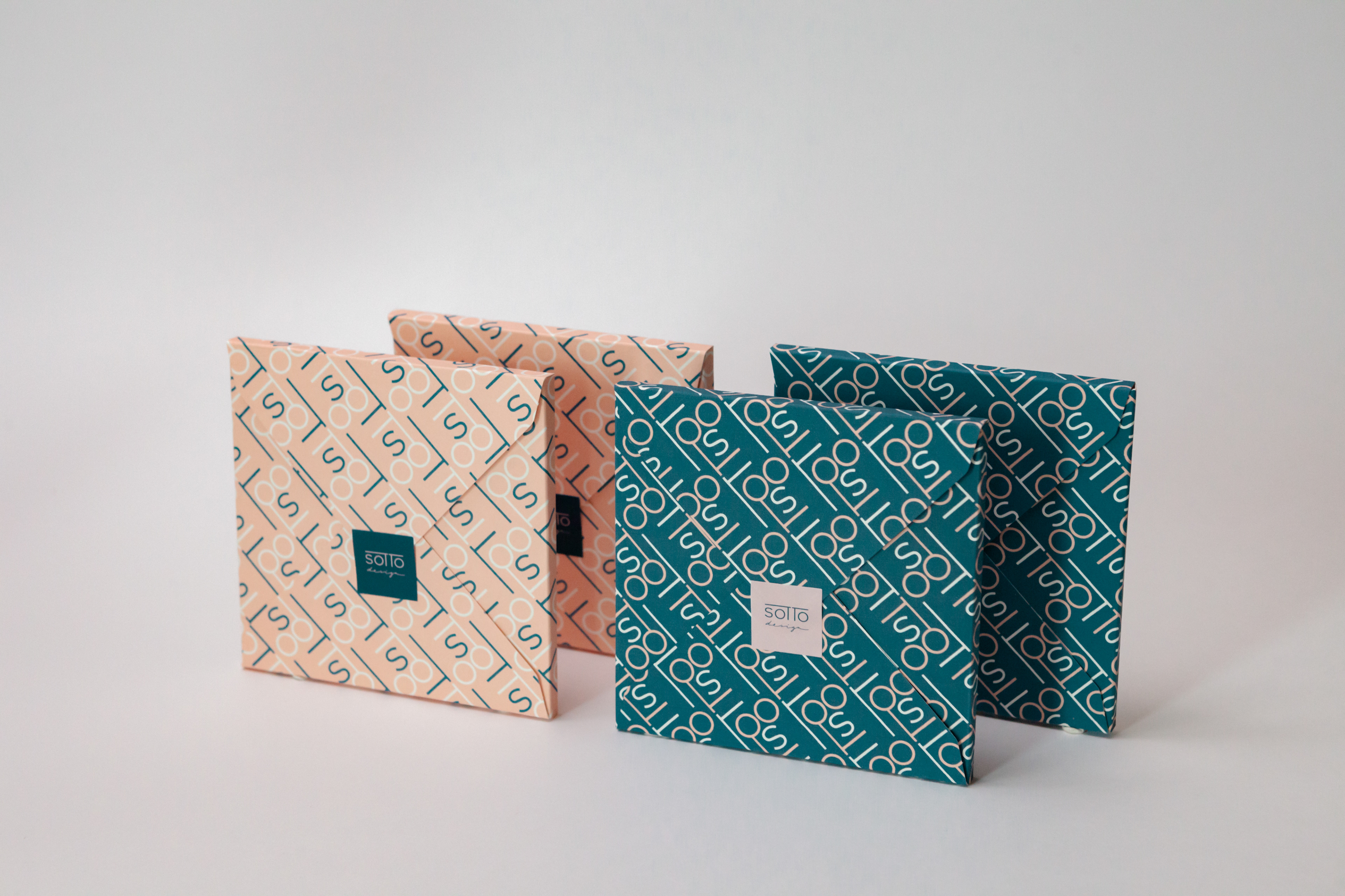
CLIENT
Sotto – Graphic Design Unit Based in Tokyo
SERVICES
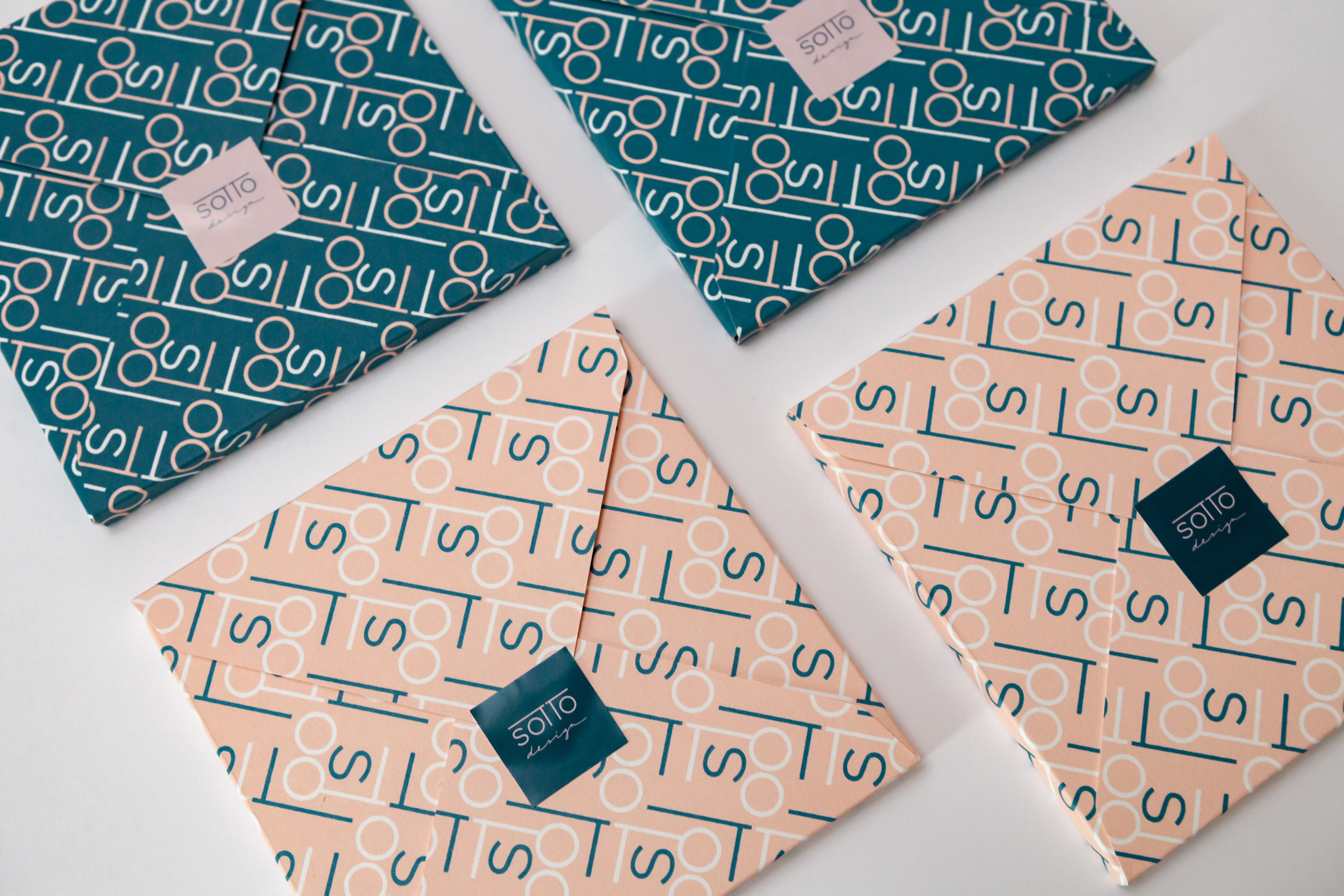
Logo Design / Guidelines / Pattern Design
STORY
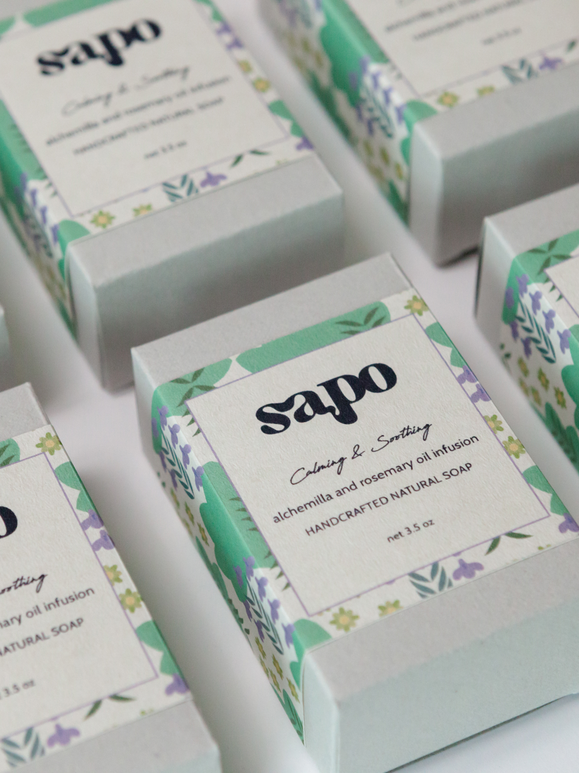
I developed a custom pattern using elements of the logo, designed to be used across various paper goods and branded materials. To support visual consistency, I also created brand guidelines covering logo usage and color specifications. The chosen palette — a refined contrast of forest green and pale pink — reflects the brand’s identity: calm, elegant, and quietly expressive.