

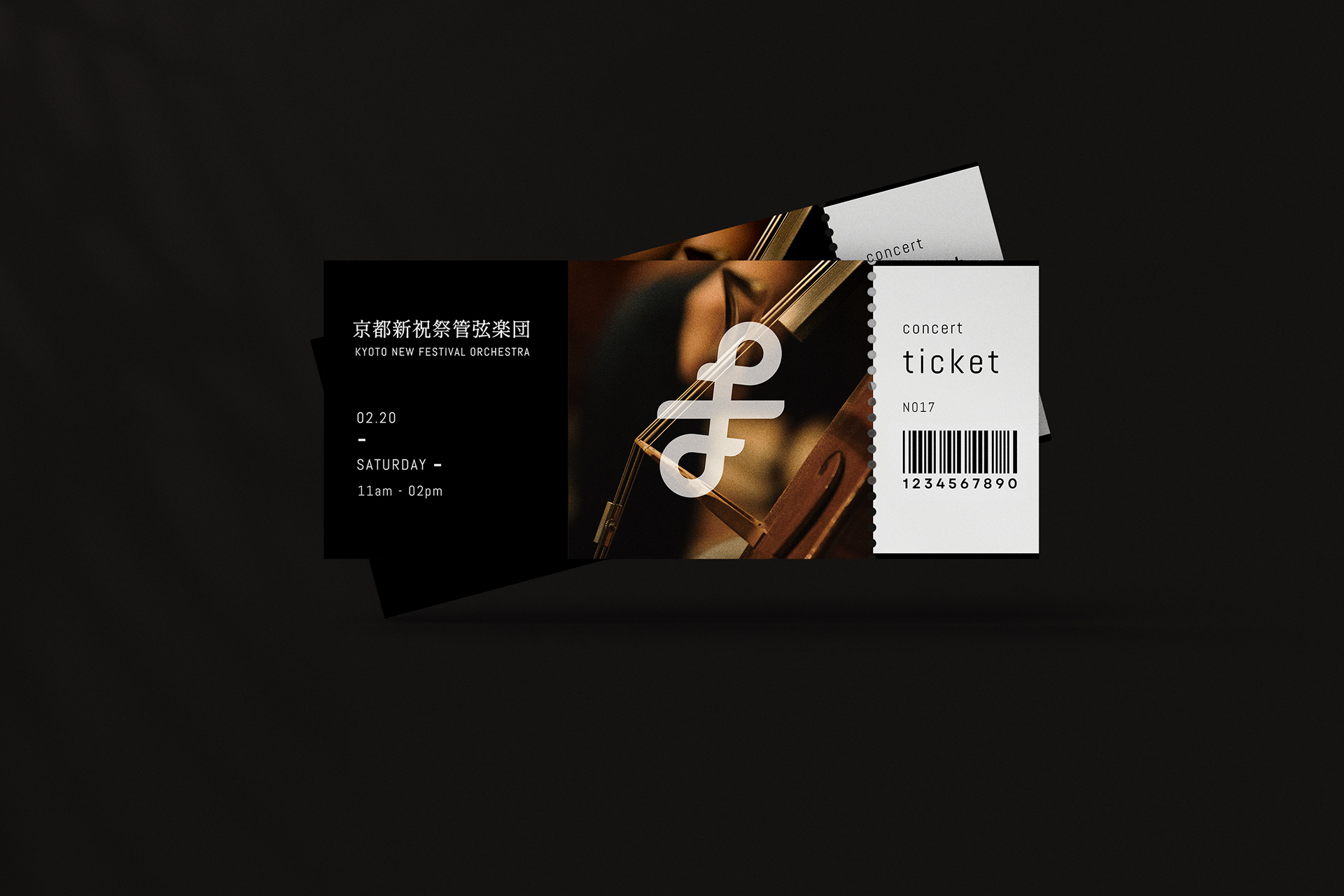
CLIENT
Kyoto New Festival Orchestra
SERVICES
Logo Design
STORY
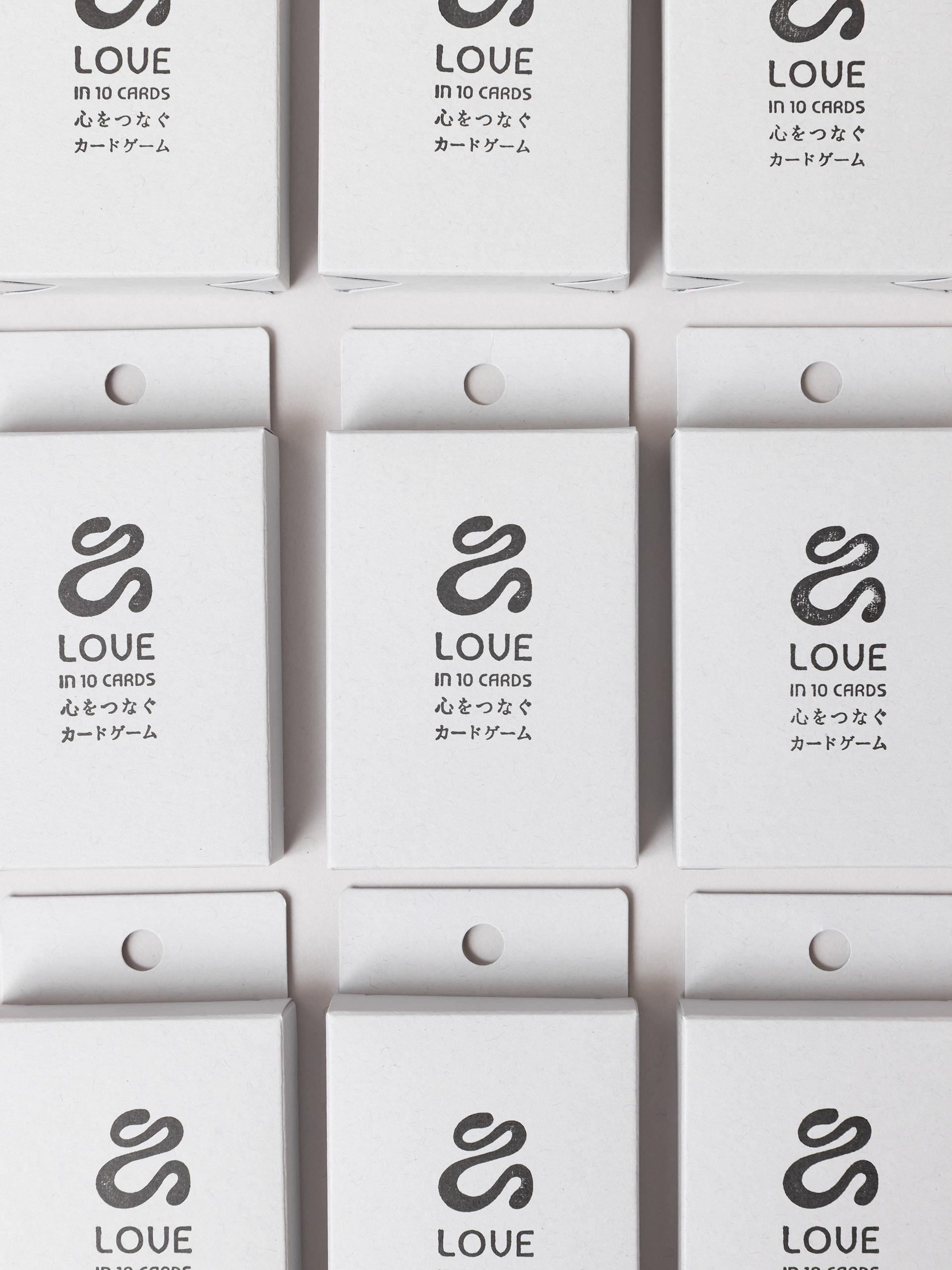
To mark its 10th anniversary, the orchestra commissioned a logo that reflects its identity: inclusive, expressive, and rooted in Kyoto's cultural spirit. In this design, two musical notes intertwine seamlessly into an infinity symbol, underscoring the harmonious and timeless bond that music creates. It also subtly incorporates the letter “F” for Festival and Forte, evoking both celebration and strength. Inspired by Kyoto's traditional kumihimo(組紐) braids, the logo visually weaves together tradition and creativity—just as the orchestra blends professional and amateur musicians in vibrant harmony.